

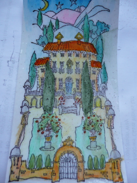
Quite a few of you have asked about the line drawings that have been propped on my iPad/book stand for weeks now. Well, they are images by Michael Powell, stamps produced by DO Crafts. Actually the image you see here is not the one on the stand, but no matter. I am not a great one for colouring in. I love the stamping and the cutting and the collating of card making, but feel a bit slowed down and erm, inadequate when it comes to colouring. So investing in two of these fine detail outline stamps was a little crazy. But totally necessary; I really am drawn to them. They speak of faraway magical places and stories yet to be told. Ahem, aaanyway, despite the shortcomings in the photography, explain this for me will ya. I coloured the image with watercolour pencils and sloshed a wet brush around a bit to blend and make it look well, watercolour-ry. Left hand photo. Then I was seized with a need to so something with it that would make it look as if I'd done more than stamp and colour. I don't know why. So I coloured the entire image in Versamark ink and embossed it with clear powder. Right hand photo. Now, is it me, or has that enhanced the detail in one fell swoop? Kinda put the black outline image on top of the colour? How? I do not know. But I like it. The collating and turning it into a card is a whole other story...apart from a mount and the fact that it doesn't fit on anything but a portrait DL card and won't take an embellishment...argh. It may not be my colouring aversion that stops me using these delightful stamps after all!


